Featured

Superman’s pal Jimmy Olsen #5

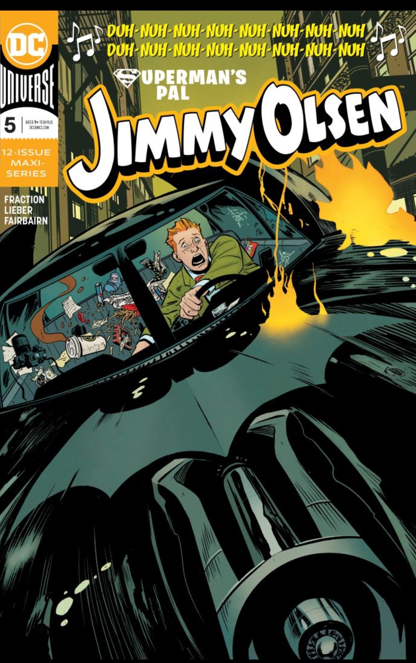
Writer: Matt Fraction

Artist: Steve Lieber

Colourist:Nathan Fairbairn

Letterer: Clayton Cowles

Every issue of Superman’s Pal Jimmy olsen is a masterpiece and this issue is no different.

Be it the near-perfect script from Fraction, or the impeccable art from Lieber, this book has quickly become one of -if not the best – books on stands right now.

(Warning: spoilers below)

Script

This issue is hilarious. Simple as that. Matt Fraction has managed to craft one of the most genuinely funny stories I have read all year, and a lot of that humour comes from his portrayal of batman. Yes, that’s right, Batman. Fraction has managed to take a character possibly best known for his ‘grittyness’ and turn him into the funniest character in the issue. How does he do that exactly? By playing into the ‘grittyness’ and ‘seriousness’ of the character and throwing him into a world of comedy.

Through this, Fraction creates a Batman that is so serious he believes he’s living in a constant war ,and even attacks Olsen because he can’t decide whether he’s a soldier or an enemy.

Other batman- related gags include: Batman believing he’s hilarious, only to find out Alfred has been paying people to laugh at his jokes and Bruce revealing to a date that he’s batman, only to immediately claim it’s not true, it was simply one of his “hilarious jokes.”

This issue isn’t just all comedy though. This is still, at its core, a mystery story and fraction doesn’t forget that. Fraction progresses numerous plot threads that have been in place since issue one, but never allows the comedy to undercut the more serious nature of these plot threads. Fraction manages to have batman confess “he’s also hilarious” while wearing a comedic arrow- through-the-head hat on one page, while having a dour funeral on the next without making either of them feel out of place, or undercutting their significance in any way. The Olson-luthais flashbacks continue this issue, and once again add to the history of metropolis, and further develop to the heated rivalry between the Luthor and olsen families which has been present since issue one.

Before I move on from the script, there are two more aspects I would like to quickly talk about, these are: the vignettes, and the non linear structure of the story. The story is presented in a series of 2-4 page vignettes; I love the vignettes because it allows the jokes to be quick and to the point. The 2-4 page format allow the jokes to be delivered in an almost rapid- fire rate, which allows a set-up, a punchline and some fallout, then ‘bang’ you’re on to the next joke or scene. It allows the jokes to be concise and to the point, without over staying their welcome. I would compare the non linear structure to why I love the non-linear structure in pulp fiction, or, to stay within the medium, to DC: The New Frontier. These stories use the non-linear structure to slow the pacing and allow the characters to gain some breathing room which jimmy Olsen does this perfectly. Jimmy Olsen #5 allows the characters to go off in strange directions without having to worry about tying into the next page because the narrative ties can be given later in the story or even in a later issue. Not only does this give the characters the freedom to move, it also adds another layer to the story as it let’s you play detective and rearrange the all these individual vignettes until you have a complete, linear story. This is absolutely genius,because it mirrors the events that are taking place in the story with Jimmy-who is rearranging separate events until he finds the person who tried to assassinate him. Adding this new layer allows you to relate and identify with Jimmy in a way that is impossible is most other stories. Fantastic stuff, Fraction!

Art

Steve Lieber’s art is beautiful. His clean, sharp lines create a perfectly simple, yet detailed book. No line is out of place ,nor are there more lines than what is necessary. Lieber’s greatest talent, in my opinion, is his character’s faces. Far too often I see artists draw the same face for multiple characters, but lieber doesnt do that, lieber gives every character their own distinct face, and manages to keep it consistent from panel-to-panel. What makes it even more impressive is he manages to make family members so similar ,yet never loses their individuality. You can see this when you look at the olsen/Olson family. Lieber manages to make every character look like their own person, yet thanks to small details, such as: giving each character the same amount freckles, or a similar nose, each character has that similar, yet different appearance that family members share.

Nathan Fairbairn’s colours go a long way to set the tone(s) of the story. Whenever the story is being comedic the colouring is brighter and really pops; but whenever the story tackles more serious subject matter, the colours are more muted and darker. Something that I noticed was how, during a rooftop vignette featuring Batman, Jimmy and Superman, fairbairn’s colours are all muted and grimy -except for Superman. Superman is still colourful and bright. I like this because it shows the contrast between batman’s ‘dark’ and ‘dirty’ world, and superman’s ‘cleaner’, more ‘bright’ world, and how Superman doesnt quite fit in batman’s world. To further add to this, clayton cowles does a fantastic thing in his lettering. Cowles presents Batman’s dialogue in a separate font. Batman’s font is more ‘rugged’ and ‘edgier’. It’s a great way to present the side of Batman Fraction is going for and it works with the script perfectly.

In conclusion, Superman’s Pal Jimmy Olsen #5 is a fantastic issue for a fantastic series. It has jokes, and gags, mystery and suspense and some truly great art. It’s one of the best series currently on sale, and you’re doing yourself a disservice if you’re not reading it!

Score: 10/10

Absolute Carnage #5

Writer: Donny Cates

Penciler: Ryan Stegman

Inkers: JP Mayer & Jay Leisten

Colour Artist: Frank Martin

Letterer: Clayton Colwes

Flashback Artist: Mark Bagley

After 19 issues of Venom, 5 Web of Carnage one shots and 5 issues of Absolute Carnage, we have finally reached the end of Act one of Donny Cates’ Venom epic! Will questions be answered? Will new questions be asked? Will it stick the ending? Read on to find out!

(Warning: Spoilers Ahead!)

SCRIPT

The answer to those questions is an emphatic yes. Donny Cates uses this issue to both wrap up numerous plot threads and set up stories for upcoming arcs. and, you know what? I think it greatly improves the ending . I know a lot of people are upset that the story is open-ended, and believe Absolute Carnage should have had a definitive ending, but I love the open ending. I love it how strengthens bonds between certain characters; if the ending was definitive, Eddie’s decision to kill Carnage in order to save Dylan’s life would lose a lot of it impact. The fact Eddie would willingly awaken Knull, and seemingly doom Earth ( along with the entire universe), makes the love between Eddie and Dylan so much stronger. But you could only have that moment with an open ending. The ending feels very reminiscent of The Empire Strikes Back, for the way that it leaves you in this moment of absolute despair. The heroes are at their lowest,and it will only get worse. It makes me want to know what comes next.

I’d like to talk about the story for a second, and the specific things that I enjoyed. I love the character dynamics that Donny Cates writes for certain characters. For example: Eddie and Carnage. I love how Donny writes them, from Carnage’s view, as a Father-Son relationship. It’s a nice element to have, especially as Dylan is clearly shown to be, at least, part Symbiote. It’s a nice twisted- mirror, possible foreshadowing for a potential story down the road. A story where Eddie has to stop Dylan from doing something deadly. Another character dynamic I enjoyed, was the one between Eddie and Spider-Man. I read in an interview that Donny Cates wanted to show Eddie and Spider-Man as Brothers who have a very complicated relationship. After reading this issue, and the previous four, Donny Pulled it off perfectly, and created a dynamic that I hope gets picked up by other writers in the future. Quickly going back to Dylan. I would like to say Donny does a tremendous job of slowly revealing just what exactly Dylan is. it’s been a thread that Donny has been developing since Dylan first appeared back in Venom #9, and i can’t wait to see it unfold in future stories. Dylan isn’t defined by the mystery of his identity, though. Dylan is a fully- formed character with a strong personality, who I genuinely care about. and that is a clear sign of Donny Cates’ stellar writing.

I love the feel of this comic. Absolute Carnage feels like Terminator 2, or a number of 80’s films. This is due, in no small part, to the way that the story never slows down. Absolute Carnage is always building towards the next big thing. The next action set-piece. Even the smaller moments are building the threat of the villain. where T2 builds-up the threat of Skynet and Judgement Day, Absolute Carnage spends every page building the threat Carnage and knull pose. Both Climax in an all out fight to the death, and this issue is Absolute Carnage’s Third Act, ‘Terminator 2’, Climax. And I got to say, Donny Cates pulled it off perfectly.

ART

I’m going to Start this by saying Ryan Stegman is the greatest Artist working in comics today. His work in this issue- and every issue of Absolute Carnage- is absolutely jaw-dropping. Ryan’s art is so dynamic and electrifying, you can’t help but be left speechless while looking at it. I’m in love with the way Stegman positions his Characters within the panel. he always chooses the positioning that will maximise the reaction Donny Cates is aiming for. There’s one panel in particular that was really striking to me. It’s the panel of ‘Satan Carnage’ on page 7, panel 1. The size of Carnage compared to Venom, combined with the perspective, really shows how doomed Eddie is, and how absolutely terrifying Carnage is. It gives me chills every time I look at it.

If I had to select one thing that makes Ryan’s art so breathtaking, I would have to pick the way he draws faces. Stegman’s art is so energetic and cartoon-y, his faces are always full of life and emotion as a result. I implore you to turn to any page and look at a character’s face. within that face, you will see so much emotion. You can see everything that character is thinking and feeling from the face alone. For example: look at the Grendel Symbiote on page 19. Here, you have a design that has no distinct features, but the way Stegman draws the eyes and smile, you get a clear notion that The Grendel Symbiote is arrogant and bloodthirsty. It’s things like this that make Stegman’s art so beautiful: the ability to tell a story through a single image.

JP Mayer and Jay Leisten are Inkers on this issue and knock it out of the park. They add so much depth and texture to Stegman’s pencils. With the shading on Eddie’s face to show how beat up he is, they really add to the tension, and make the already high stakes even higher. Frank Martin joins on colours and, likewise, does a tremendous job. From the dirty greens of the rain, to the glowing whites and yellows of Carnage’s eyes, Martin builds a truly unsettling atmosphere that matches the Issue’s tone perfectly. And finally, Clayton Cowles provides the lettering. Clayton is one of the top letterers working today, and this issue proves why. The way Clayton gives both Carnage and Venom individual word balloons is genius. it proves how alien they are, not just to humanity, but to each other as well. Also, the choice to give an injured Spider-Man weak, squiggly-lined balloon boxes is a nice touch that adds to visuals from Stegman’s art. Also, Clayton uses onomatopoeia to great effect. They are perfectly positioned, and compliment the impact of the art and script, perfectly.

IN CONCLUSION

Absolute Carnage #5 is a fantastic conclusion to over 2 years of story. It answers a great deal of Questions, but sets up a whole load of new ones, which will no doubt be answerd in the coming months. with great writing and some amazing art, Absolute Carnage #5 is a must read.

Rating: 8/10

Excalibur #2

Writer: Tini Howard

Artist: Marcus To

Colour Artist: Erick Arciniega

Letterer: VC’s Cory Petit

After being crowned the new Captain Britain, Betsy Braddock, along with Gambit, Jubilee, Kate Pryde and a glowing, comatose Rogue, embark on a journey to Otherworld to free Betsy’s Brother (the previous Captain Britain) Brian Braddock , and to find out just what is happening to Rogue. Meanwhile, Apocolypse is moving the group around, as if they were pieces on a chess board. Is Apocalypse up to something? Read on to find out.

(Warning: Spoilers ahead!)

Script

Before I begin, I want to say that I liked Excalibur #2. I liked it, but I didn’t love it. Excalibur #2 does some good things, but it also does a lot of bad things. It’s the bad things that really hold the book back from being as good as it should be. To prevent this review from being overly negative, I’ll begin with the book’s positives. I really like how Tini Howard writes Betsy. I like that she doesnt necessarily want to be Captain Britain,but realises that she has to in order to stop le Fey and save her Brother. These selfless acts make me care about Betsy, and gives me a reason to invest in the story. I also like Apocalypse’s role in the book. He’s like palpatine from the prequel trilogy- someone who has a plan and is able to manipulate the people around him to achieve his goals. Tini is playing Apocalypse’s true goals close to her chest, and that mystery is one of most interesting things about the book for me. I’m sure the next few issues will really build this thread, and I hope it pays off when the penny drops. Another thing that I like is the world that this story is taking place in. I love the magic and fantasy elements, I love the mystical characters that appear, for example: the Monks that are invisible to all but Betsy. I love the feeling of not knowing who could appear next, and I hope this continues in future issues.

With that said, let’s move on to the stuff that I didn’t like. For all the good that Betsy and Apocalypse bring to the book, I can’t say the same for the other characters. I feel like Gambit has no real point of being there except to worry about Rogue. I know Rogue’s his wife, but I still expect-within 22 pages-one of the 5 principle characters have something of importance to do. It’s not a lot to ask for. Jubilee is similar; she doesn’t do a lot other than feel sad over leaving her son. I mean, yeah, that subplot is directly tied to Apocoalypse and you witness some back and forth between them,but there still isnt a whole lot she does in the issue. However,going off the final page, that could likely change in upcoming issues, which is a good thing. Jumping back to Gambit real quick, he just lounges around complaining about Rogue’s predicament for most of the issue. He doesn’t impact the story at all. That’s my main problem with the issue-about a third of the book is dead space. There is a ton of pages that could either be devoted to Apocalypse or Betsy;or even to scenes where Gambit and Jubilee impact the plot. But no, instead it’s given to scenes that don’t add anything.scenes that if were removed, wouldn’t really detract from the story.

Again, I would like to say that I liked the issue, it’s just that Gambit and Jubilee make the book feel unfocused in places. If they had more to do plot wise, the issue would improve vastly, and the script would feel a lot tighter.

Art

Marcus To does a good job with the pencils this issue, and I especially love how he draws action. It’s fun and engaging, and is definitely one of the highlights of the the issue. I also love his designs for all the different characters the group encounters. They build upon the mystical feel of the book perfectly, and gives it a rich, lived-in feel. Erick Arciniega does a fine job of colours too. I appreciate how he tweaks the colours depending on whether they’re in reality or a dream. It’s a nice touch that prevents the issue from becoming confusing. I also enjoyed Cory Petit’s lettering. I enjoyed how he would change up the size or font of the onomatopoeia’s depending on the context, for example: whenever there is an explosion the onomatopoeia is big and blocky, where as whenever there is a creaking or something unsettling, Petit makes the onomatopoeia rigid and sharp. It’s a great addition that helps cement the atmosphere, that Tini, Marcus and Erick set.

In conclusion, Excalibur #2 is a fun, but unfocused issue that moves the story forward,but leaves a few characters behind without much to do.

Rating: 6/10